

A systematic environmental graphics program can help unify the look - and even the emotional resonance - of sports and recreation facilities.

This is environmental graphics.
In a simpler time, "graphics" referred primarily to lines drawn on paper. Take the word back to its Greek origins, (γραφειν, "to write") through its English landfall by way of the Latin graphia, and you can help describe methods of writing (biography), drawing (calligraphy) and even mapmaking (cartography). But graphics is a flexible term, and as technology produces new mediums for visual representation - cave wall to canvas, paper to vinyl, billboard to scoreboard, today's digital display to tomorrow's - each in turn becomes part of this quickly expanding world.

 Arizona Cardinals stadium graphics
Environmental graphics' practical concern is communicating to a building's users where to find what they need - the rest room, concessions stand, luxury suite, front desk, first-aid station, locker room, pool, elevator/escalator, exit. But environmental design carries a wider purpose - "shaping a unique idea of place" in industry-speak - which ranges from the purely aesthetic to more subtle forms of communication. The latter could include product advertising, as well as wall murals that "advertise" the history or accomplishments of the university, team, athletes or others associated with the facility. Since environmental graphics can include the building's color palette as well as words, photographs and various building materials, it is sometimes difficult to tell whether a given example of design is the work of the graphic designer, building architect, landscape architect, interior designer or industrial designer. In fact, the biggest change in the field of graphic design is the way these various professionals work together to achieve their aesthetic goals.

"There was a time, even after architects no longer drew elevations and sections by hand, when graphic designers and architects used different computer programs, and landscape architects used a third type of program," Phelan says. "But now, all our digital communications are able to speak to each other, so the architects' drawings of all the different views can be imported for graphic designers to use to do layouts on walls and ceilings, and fabricators now use computer programs that graphic designers can more immediately connect with. Everything has just converged."

"We're doing a job at four different venues for Nike, where through graphics we're temporarily completely changing the look of the buildings," says Jim Lutz, president of Gaithersburg, Md.-based Arena Graphics Inc. "Walking into one of them, you'd swear you were walking into Kobe Bryant's Nike Basketball School, not a high school."

"It all looks permanent, and we can do the same thing even for once-a-year users of the building such as the ACC tournament," Lutz says. "We can make the buildings seem more personalized to an event or team, in the way that the NBA altered the Las Vegas skyline during the All-Star Game with building-sized murals and banners. The technology has made printing these things so affordable - for the NBA, anyway, if not the typical high school."

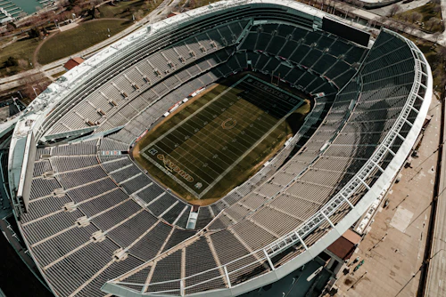
As impressive as these temporary applications are, such limited building alterations could not suffice as the foundation of an entire design discipline. Clearly, as the University of Phoenix Stadium shows, an awful lot of little details add up to make a huge difference in a building's "feel."
Seeing the difference is one thing - getting a handle on the discipline's parameters is quite another. Does a metal identifying sign placed 30 feet in front of a building, or a quotation by the university president etched into a block of granite in the lobby, fall under the heading of environmental design?
Apparently, yes. And integrating those elements into a consistent style falls under the purview of the environmental design professional.

Next, assuming the clients have not yet weighed in on the design process, the graphic designer consults with them and tries to understand their idea of what the building is trying to "say." Chris Hayes, associate vice president of environmental graphic design in the Washington, D.C., office of architect Cannon Design, says it's all about knowing your audience.

"The bottom line in today's world," Hayes adds, "is recruiting fans, athletes, students, staff, members. If it's a city rec center, you're recruiting people to join. Who is your target audience, what do you want to say, and how do you deliver that information?"
It is here that the graphics professional begins digging through the archives, if you will, to come up with team or school photographs, historical imagery, and sample colors and logos for the client to consider. These days, a huge question is how the client intends to honor donors to the program or to the construction of the building, or even to the construction or purchase of its various components. Each level of donation will likely be honored in different ways, but within the same color and graphics palette. "We ask the client how all these things resonate - we're looking for a style, a way to convey their identity, before we come back with actual designs," says Phelan.

Branding is understood by most people to mean a company logo: The Nike swoosh, the Dallas Cowboys lone star, the CBS "eye." In environmental graphics, the brand might be communicated by the building's lighting, by the team's colors, by the recreation department's mission statement sandblasted into a wall, by an image etched into plate glass. " 'Brand' is not a logo or tagline, it's really about The Idea," Hayes says, stressing the phrase. "It's about making the visitor experience more appealing and memorable. You want people to feel comfortable, but more than that you want them to feel linked to that space. It's all related; it's not just putting up a pretty picture."
The danger, aside from visual clutter (see "Font and Center," page 38), is that by emphasizing and reemphasizing the brand throughout the facility, the design will veer from something "true" about the team, university or town into something so slick and ad-like that people are put off by it.
"It's important that your message is expressed in an authentic way," Phelan says. "It used to be that Coca-Cola, say, or the University of Cincinnati knew that people were going to come to them. But now people selling a product realize that they have to move toward the user of the product. We have to create an experience that the user feels connected to. Not only can that not be done with just a logo, it can't be done by graphically applying a look and feel that's supposed to be historic but really doesn't carry any feeling for people. Even for a person who's not a graphic designer, it's obvious when this fake nostalgia is slapped onto a brand-new building."

A simple set of rules guides the production and placement of most signs. Keep them simple and direct. Make the type large enough to see clearly, and the colors complementary but contrastive to aid in visibility. Make sure they're positioned where they are likely to attract patrons' attention.
In many buildings, the typical user gets to know the space through multiple visits, sending even the most sophisticated signage system into the background over time. In a recreation center, the basketball enthusiast can find the gym on the second visit. But in an arena, where the odd-numbered sections go one way and the even-numbered the other, and the customer base is split between season-ticket holders and first-time visitors, the signage may be all that stands between order and chaos.
Still, many building owners see a sophisticated graphics system as an "extra," something for which they just will not budget. Worse yet, some architects remain stuck in a graphics time warp, where branding means drowning a building in the team's colors so that the typical hierarchy of information can't be discerned.
Nancy Freedman, a principal with Sasaki Associates, notes that graphics programs can fail in two distinct, but equally annoying ways. If signs don't aid in wayfinding, you can't find your car, or the rest room, or the emergency room. And if they're not rendered with a light touch, they can be just awful to look at.
"We try to explain to our clients that it's like jewelry," Freedman says. "When it's done well, you don't really notice it: 'This person looks really together.' When it's done poorly, it's clutter. You think, 'God, what was she thinking?' "
Jim Lutz, president of Gaithersburg, Md.-based Arena Graphics Inc., has noticed that facility owners are moving away from the type of advertising that used to plaster every surface. Not in baseball stadiums or hockey rinks, where there's an established history of outfield wall and dasher-board signs, but in basketball arenas in particular: There's a cleaner look now, with actual wall surfaces in view that show team colors perhaps, but few ads.
The reason? The cutting edge in sponsorship signage is digital.
"These days, you have to be able to get people's attention," Lutz says. "You see it in the way interviews are edited even, where the camera never sits still, there's just constant action, motion. It's the same thing with ads. No one wants a sign that's just stagnant. We're still doing a lot of backlit signs and so on, but most clients are going toward the stuff that's moving, with sound incorporated into it. Now you have ads that get people's attention, but they only take up a small portion of the available space."
Chris Hayes, a graphic designer with architect Cannon Design, credits MTV and ESPN for the advertising transformation. "Younger people are the target audience, and they cut their teeth on things that are fast and active, so you have to enliven the space with that kind of iconographic imagery. It's the trend of the future. We're seeing more environments where owners are implementing visually interactive elements, whether it's video projection systems or touch screens. It keeps things fresh. In five years, everything will have changed - the schools, team rosters - you really don't want to have thousands and thousands of dollars invested in static information."
Font and Center Building owners have to communicate a lot of information to building users - they must let them know where to find what they want (nachos), need (seats) and really need (rest rooms). At the same time, the signs must inform and direct while carrying the team or school's "brand."
Moreover, each building type has its own hierarchy of information, according to Cannon Design's Chris Hayes. "If you enter a hospital and you're bleeding to death, you should be able to know where the emergency room is just by looking up at a sign," Hayes says. "It should scream at you, 'This way!' "
Hayes prefers all signs to carry the same font family, but in situations where two types of messages hold equal weight, separate fonts may be necessary. "Sometimes one font can be more informational and one more directional," he says. "But I don't like to have a cacophony of fonts everywhere. Signage should help brand the space, but it also has to complement the building architecture."
Complementing the architecture is sometimes a bit of a trick, given the whole class of signs required by building codes - egress signage, mechanical/electrical closet signs and ADA-related signs, to name just a few. Many have requirements related to type height, sign contrast and the like, and many carry elements such as Braille that can be configured in only one way. However, designers do retain some creative flexibility within those constraints.
"The thinking has to be sophisticated enough so that you create a visual language that may vary from sign category to sign category," says Michele Phelan, co-director of graphic design for Sasaki Associates Inc. "You can almost layer the graphics in a way that there's a certain design vocabulary that you use to express identity, and another vocabulary that you use to help people find their way, and sometimes they overlap. If everything had the same size, same typeface, same color text and same color background, you'd have visual chaos."