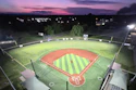
Brands. We can identifythem instantly by a logo, a color palette or a slogan. We may become loyal to a particular brand’s products. We might be willing to spend a little more for one product — however similar it may be to another — solely based on brand alone. In some instances, we’ll even defend or promote a brand if we’ve sufficiently bought into that entity’s style and professed ethos.
Perhaps most importantly, especially when it comes to athletics, fitness and recreation facilities, a strong brand with a clear mission has the power to persuade and unite people, drawing them together through a consensus around an ideal or shared mission.
Nearly all professionals in these industries are deeply committed to their brands, and for good reason. In collegiate athletics, a strong brand could be the difference between signing or losing a top recruit. In the fitness world, branding is, in many cases, the thing that attracts and retains members. In the realm of campus recreation, a cohesive brand can foster in students and staff feelings of inclusion and community, ultimately bolstering the success and common mission of all who pass through a rec center’s turnstile.
Photo by Christy Radecic courtesy of Kahler Slater
Returning to the brand
Big Ten stalwart Indiana University is no exception. For alumni, the IU brand — the overlapping letters forming the familiar trident logo, the cream-and-crimson palette, the feeling of gamedays at Memorial Stadium and Assembly Hall, the promise of a solid academic foundation — is a lived experience that will drive merchandise purchases throughout their lives, possibly lead them to encourage their children to become Hoosiers, and maybe even prompt them to donate to the university.
Unfortunately, for years, students walking into IU’s main recreation building had no way of knowing they were on the Hoosiers’ campus. The building itself felt like an island unto itself. It wasn’t an oversight but a deliberate choice made in 1995, when recreation departments across the country were pushing to establish their own identity, separate from athletics and from the university brand writ large.
As Hannah Laughlin tells it, the rec center she walked into when she was hired was entirely divorced from the otherwise vibrant IU brand. “Our building was blue and green and yellow,” says Laughlin, associate director of Recreational Sports, “and our staff were told they could not wear red shirts to work.”
Photo by Christy Radecic courtesy of Kahler Slater
Laughlin says the idea of the recreation department existing separately from the rest of campus just didn’t make sense, and it looked like it was time to do something about it.
IU’s rebrand of the Student Recreational Sports Center (SRSC) wasn’t the product of a long-range facilities master plan. It was, as Laughlin describes it, “a perfect storm.” The department had just brought on a new leadership team, there was a modest reserve of repair and renovation funds freed up during COVID-era closures, and there was just enough institutional goodwill to make a fast, visible change.
“There’s 800 student-athletes that get to walk around these amazing places that are all branded up IU,” says Laughlin, “and we just thought we have the opportunity to do that for the 48,000 other students at the school.”
Laughlin admits that her department didn’t have the $200 million that a Michigan or Michigan State might have had to build a new rec center, but it did have the resources to give the building a facelift. The result, which would completely revitalize the space, is a testament to the heavy lifting branding can do.
Photo by Christy Radecic courtesy of Kahler Slater
Laughlin, along with associate director Josh Downing and executive director Chris Arban, didn’t set out to build something new. They set out to look at what they already had and assess whether the space was serving students, and whether those students felt a sense of ownership.
The answer, in places, was no. Sixteen racquetball courts sat mostly unused while students lined up for strength equipment. The building’s best-lit room, which was flooded with natural light, housed the IT department. None of that required knocking down walls to fix. Instead, the IU team pursued reallocation, a coat of paint and a clear mission to reimagine the SRSC as an integral part of the IU brand.
“We looked at every single square inch,” Laughlin says, “and decided we didn’t need 16 racquetball courts anymore. Let’s make some of them strength spaces.”
The strength gym was completely redone as part of the effort. Four platforms for Olympic lifts and squats became 16, then 24, and a fresh influx of new lat pulldowns and benches were installed — all under a fully IU-branded identity. It was the single-most-requested upgrade from students, and it happened without adding even a square foot of space to the building.
Photo courtesy of Indiana University Melody and lyrics
If IU’s story illustrates what a branding-first approach looks like on the client side, Thysse, the creative manufacturer behind two decades’ worth of branded environments at the University of Wisconsin, offers a good example of what it looks like from the design side.
“The architectural design and the interior design are essentially the melody, and the branding piece, the environmental graphic design, is the lyrics,” says Thysse director of marketing Kevin Dorsey.
A space, Dorsey says, can feel energetic or calm through form and material alone, but if an organization wants to say something specific to the people walking through it, that message comes from the graphics, color and typography layered on top.
It’s a useful distinction — one that’s honest about branding’s limits. “Environmental graphic design can’t change the use of the space,” says Kris Marconnet, a senior designer at Thysse.
If a room isn’t big enough, she says, or the layout doesn’t support what an organization needs it to do, no amount of wallpaper solves that. But short of a structural constraint, Thysse’s team argues there’s remarkably little that branding can’t touch. From a full locker room overhaul to a single concrete corridor behind a press box, environmental graphic design can work wonders when activating those spaces.
Thysse’s own portfolio at Wisconsin bears that out. The firm has undertaken 29 projects across 18 buildings on campus, ranging from a 2014 men’s basketball locker room revamp — which included 500-plus individual design files, LED-lit dimensional logos, and reclaimed floorboards from a retired Kohl Center court — to more recent overhauls of the hockey program’s offices and the university’s broader recreation and wellness spaces.
Counterintuitively, the Thysse team sees indistinction as a benchmark for success on any given campus. “If we’ve done our job well, you can’t tell the difference between a space that underwent full construction and one that was transformed through graphics alone,” says Marconnet, adding that the finished space should feel so architecturally intentional that visitors assume it was always meant to look that way.
Photo courtesy of Indiana University
On a constrained budget, Marconnet says there are small elements that can result in big impacts. She points to two-dimensional wallpaper as an outsized opportunity, noting that it reads as vibrant and large in scale, and unlike lighting-heavy installations, it doesn’t require a massive budget.
When choosing between a less-expensive two-dimensional wallpaper and an electrically lit element, Dorsey says the decision often comes down to whether the space already has power, or whether budget will have to be allocated to run power to that area.
Thysse deals with budget issues strategically. Dorsey estimates that roughly 80% of the projects the firm sees are broken into phases that span multiple budget cycles. For instance, a space might be engineered in an early phase with wallpaper designed to look finished on its own, but then dimensional elements such as lighting or donor-recognition displays are layered in later as funding allows. It’s a model built for exactly the kind of institution that doesn’t have $200 million sitting in a capital account.
Photo by Image Studio courtesy of RecWell
Branding at scale
While IU was able to reenergize a building with branding alone, Britten, a large-scale event fabrication company based in northern Michigan, works to use the same principle when it comes to activating events. This year, Britten fabricated volunteer centers at all 16 FIFA World Cup venues, then converted those same spaces into lounges and hangout areas once the tournament began. The company also builds sponsorship activations, stadium graphics and branded environments for college and professional teams, and is already bidding on work for the LA28 Olympic and Paralympic Games.
Britten’s approach leans more temporary and event-driven than Thysse’s long-term campus partnerships, but the underlying logic remains the same, reasoning that a blank space, branded well, can create the kind of experience new construction alone can’t guarantee.
“If you’re a high school or college athlete and you walk into the gym, you have these inspiring graphics of past athletes and core values up on the wall,” Britten director of marketing Bryson Wilbert says. “A blank wall, that’s not going to do anything for you.”
Photos by Image Studio courtesy of RecWell
The same principle scales up dramatically for Britten’s stadium and event work, which includes oversized foam sculptures, building wraps, even shipping containers converted into fully branded activation spaces for corporate sponsors.
Wilbert also points to a dimension that the campus facility conversation tends to lose track of, noting that branded, immersive environments aren’t just backdrops anymore, they’re content. “We’re creating these things as pretty photographable moments,” he says, describing how well-designed activations get captured and circulated on social media, extending a branded space’s reach well past its physical confines and those who walked through them.
Britten’s process starts from wherever a client happens to be, which can vary across a broad spectrum. The firm recognizes that clients sometimes want to truly educate beyond mere storytelling.
Wilbert described a recent project for a dental-implant brand struggling to explain its product at trade shows. Britten’s solution was a massive sculptural tooth that made an abstract medical concept immediately legible. “There isn’t always a story to tell, or even maybe a problem to solve,” Wilbert says. “That really just depends on what they’re trying to accomplish.”
The proof is in the reaction
Back in Bloomington, the clearest evidence the IU rec rebrand worked isn’t in a budget line item, but rather from students and visitors. Downing says student-reported connection to IU and sense of wellbeing have both scored above 95% since the rec center underwent its facelift. The building is now a stop on the university’s admitted-student tours, and staff say prospective students and their families routinely react to the space without knowing anything structural changed.
“I know people that came through our building prior to the branding effort, and then came back through with a younger child,” Laughlin says, “and they would not know that it was just a branding effort. They say, ‘Wow, your space is really cool,’ whereas before they weren’t impressed with it.”
Wayfinding also turned out to be its own quiet win. Upperclassmen who had walked the same hallways for years had simply never noticed a strength gym or a cycling studio tucked at the end of a corridor, Laughlin says, largely because nothing told them it was there. Clear signage changed that almost immediately.
In the end, whether embarking on a large-scale project or activating a once-every-four-years event, the lesson scales in both directions. A rec center in Bloomington and a World Cup volunteer center share the same logic: the story was already there, waiting for someone to tell it. As venues gear up for LA28, and the next wave of campus renovations competes for shrinking capital budgets, that logic is only going to matter more.
Construction changes what a building is. Branding changes what it says, and increasingly, that message is doing the work that used to require a wrecking ball and a capital campaign.




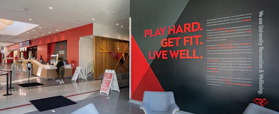

 Photo by Christy Radecic courtesy of Kahler Slater
 Photo by Christy Radecic courtesy of Kahler Slater
 Photo courtesy of Indiana University
 Photo courtesy of Indiana University

 Photo courtesy of Indiana University
 Photo by Image Studio courtesy of RecWell
 Photos by Image Studio courtesy of RecWell