There was a moment when stepping onto a piece of cardiovascular equipment began to resemble stepping into the cockpit of a jetliner.

There was a moment when stepping onto a piece of cardiovascular equipment began to resemble stepping into the cockpit of a jetliner. The number of options available to the user - whether related to the workout or the entertainment designed to enhance the workout experience - had exploded, but a console had yet to be built to accommodate them all in an organized, streamlined fashion. Buttons of varying sizes and in a range of colors, graphs, flashing LEDs, numbers showing one measure of workout success overlaying a second set of numbers showing another, all crowded onto a growing dashboard. Then video screens were added.
Touch screens have changed all that. But as much as touch screens have the capacity for simplifying the experience of the exerciser through the layering of controls and information, they haven't changed the complicated nature of console design. Controls need to be simple to navigate, in sync with the ergonomics of the exerciser's movements and consistent with safety regulations. Color, size and contrast, and the corresponding design of words (including font size and style), need to merge into a language that will aid, not hinder, users' comprehension. It's no wonder that as much labor and money is dedicated to console development as to the biomechanics of the machines they control.
And because touch screens accommodate a broader and deeper hierarchy of controls, the number of levels is multiplying. There's a raft of audiovisual controls, for the machine's own screen, the fitness center's bank of shared screens or the user's iPod or other devices, and controls for sound, multiple video options and navigation between menus for music, TV or Web browsing. And that's just for AV. The options related to exercise - including preprogrammed workouts, measurements of workout effectiveness and so on - are far too numerous to list. Offer an option for a fan, and you need controls for the fan.
"There's this inverse relationship in console design," says Adam Hubbard, director of product management at Woodinville, Wash.-based Precor. "The simplest user interface is the most complicated to design, and traditionally, the most complicated user control solutions often have had the simplest designs."

Interface developers work within various parameters, some more defined than others. Hubbard notes that size, color and font used on the "STOP" button on treadmill displays (not to mention that piece of equipment's additional physical stop button) are delineated by organizations such as ASTM (F2115-12 Standard Specification for Motorized Treadmills) and CE (the European equivalent). "While there's a lot of latitude with regard to how the user best engages with the product, there are things that need to be universally understood," says Hubbard. "In a car, the brake pedal has to be on the left. You can put the AC controls wherever you want, but there are some fundamentals that need to remain constant."
Other parameters amount to what Steve Suchanek, director of product management for Medway, Mass.-based manufacturer Cybex, calls "tribal knowledge," basically the industry's gathered wisdom.
"You could also call it de facto knowledge," Suchanek says. "With one exception, every treadmill out there has the speed button and controls on the right side. It's been that way for 25 years. Since day one, somebody figured out that you can manipulate buttons better with your right hand than with your left."
But each of the different types of cardio equipment offers a different test for designers, given that the user is running or walking (treadmill), striding with feet planted (cross-trainer) or sitting (bike). Handedness is therefore less of an issue - tell that to a lefty - than whether the user's body weight is supported during the exercise and whether operating the equipment from the user's position requires gross motor skills or fine motor skills.
"If you're running on a treadmill, your direction is very related to where your hands are," Suchanek explains, noting that his aim is therefore to place speed and incline controls directly in the center of a treadmill's console. "If you were to start moving controls outward, those little nuances in body posture could get you to go that way. We place them so you kind of stay on path. On an upright bike, where that's not an issue, we're kind of directed to approach everything from a 'Can you reach it?' point of view."
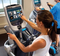
Equipment requiring greater coordination necessitates that designers take the user's stability during console operation into account. For Cybex, that means keeping a space for the user to place one steadying hand while using the touch screen with the other. "We want to eliminate double hits and two fingers on the surface, things like that," Suchanek says. "It makes for a much more positive experience."
Such issues are what separate the design of touch screens for fitness equipment with their antecedents in the phone market. Users of iDevices, for example, are standing or sitting still, and can afford however much time it takes to find whatever they're looking for.
"There's an ergonomic component, certainly," Hubbard says. "We understand that people are in motion, so it's not the most conducive environment to read, the way a desktop computer is. We understand that many people wear corrective glasses, but maybe not when they work out, so we have to be really thoughtful about high contrast and font size, and how they affect readability.
"A lot of console design is about selecting the appropriate technology for the appropriate function," Hubbard adds. "You'll see on our P80 console that we've got really large motion controls, because we know that somebody who's running at seven miles an hour doesn't want to be using those fine motor skills to locate an index finger on a small screen while in motion. They want a really large control that's easily found, so they can use gross motor skills to accelerate or decelerate without a lot of fine-tuning."

If touch screens aren't always the most appropriate technology for a specific movement, they have solved (as noted) one of the more perplexing problems in the fitness industry - what to do with all those buttons. Even still, not all manufacturers approach multiple layers of information in exactly the same way. "Touch screens free you up to do an infinite number of things," says Hubbard - but which things ought to take precedence in the operational hierarchy? "You have to anticipate the needs of the user to make the product functional and intuitive," he says. "It's industrial design combined with a little consumer psychology."
Suchanek says that most manufacturers in the touch screen era walk the line between two distinct theories of console design. On one side is the serial approach, in which the user can perform almost any function with three buttons. "The challenge to that is the user will have to enter lots and lots of info, so setup will be very, very slow," Suchanek says. "People don't like that, and neither do I. If people feel like they look stupid setting up their workout program, they won't take advantage of it. They'll take an easier out."
The second design theory, the parallel approach, puts every choice in front of the user. "If you have 30 programs, there are 30 program buttons. There were some examples of this in the early '90s, not quite the 30, but lots of buttons," Suchanek says, noting that his metaphor of choice goes beyond jetliners all the way to NASA. "I have a picture of the cockpit of the space shuttle that I take out whenever we start talking about display ideology," he says.
A hybrid approach is not only logical - touch screens allow for intuitive graphics (icons such as apps) that take users to more-detailed menus - a certain amount of its logic is inescapable.
"I'd say that's true," Suchanek says. "If you're going to use a treadmill, the controls follow a kind of flow chart. The 'quick start' function is really obvious: You press go. Then you get speed up and down, incline up and down. If you're going to do a workout, what are the potential variables? Type of workout, level of the workout, the user's goal - is that strictly time-based, or time and distance, or strictly calorie-based? Those can become choices. Body weight is one where, even if you hit 'quick start' on a product like a treadmill, where caloric expenditures are proportional to body weight, we'll ask you the question later. There is a logic to it, and nobody's logic is terribly different; the difference is in how it's implemented."
One notable trend in implementation is seeing console designers match the font, color, size and placement of information to the machine's presumed user. "Most of the time, you would notice in our interface that the first steps, when we are still not sure about which type of user is on the equipment, we have designed assuming a beginner," says an expert on interfaces in the Technogym Research Centre in Cesena, Italy (company rules forbid us from identifying him). "In the beginning, you'd notice very few buttons, and very large and clear labels and instructions, in order to make sure that if you had 100 people stepping on our equipment, all of them would be capable of starting their workout without any help. But later during the process, if you select a type of content that we consider to be more advanced, then we might allow for smaller fonts, or more detailed backgrounds."
"As we have moved into a touch screen environment, it has become much more dynamic," Hubbard says. "It's much simpler for users, because the only things that are presented are those things that are immediately relevant to them."

The console on a piece of cardio equipment is its face - and, very often, its handshake. For years, stepping on a piece of equipment meant making that first-time introduction over and over, notes Hubbard. "I use the analogy of the arcade experience," he says. "If you think back to the '80s, you dropped your quarter into an arcade game, and it didn't know who you were. Everyone was delivered the same experience. And when your quarter was up, it reset. Move that over into the fitness world - well, every time you work out, if you really want a more accurate calorie count, you have to tell it your age, and if you want more accurate heart rate information, you tell it your age and weight, and so forth. As soon as that workout's over, it's all gone. But with our new products, we can move beyond that, where we start to personalize the experience for each user."
Consoles have taken the next leap forward, from accommodating users' personal devices such as smartphones and iPods to integrating with networks to store users' workout data and personal preferences, which points to rapid future change in the nature of the user interface.
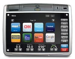
Technogym made a splash two years ago with Visioweb, the first networked equipment, and upped the ante considerably by using Visioweb as the portal to its new "mywellness cloud" digital platform that "stores data in a central server and allows operators to create an ecosystem around the facility to attract and engage members though their phones, tablets and computers," according to the company.
"Before we designed Visioweb, we had to indirectly assume that you are a beginner if you pressed 'time,' or advanced if you pressed a different button," says Technogym's interfaces expert. "But now, since your personal account is stored, it can be retrieved using a system key or a mobile app that uses a QR code to log you in. You can customize some preferences such as the list of websites you want to see, or store the credential to log in to your Facebook page, and we will know how experienced you are so we can start conceiving new interfaces that are more suitable to you and your level of experience."
Likening Precor's network-connected P80 console, its top-of-the-line user experience, to an industrial-grade tablet, Hubbard says that even he is surprised by the rapid pace of technological change. "A few years ago, when fitness equipment manufacturers sold a piece of equipment, that was the best it was ever going to be. To get an update, you had to buy the next generation of equipment," Hubbard says. "Now, we can continually enhance features and provide new, rich data to improve the experience, and at the same time keep it personalized to each user. It's a big paradigm shift for us."
Giving users access to their personal data and devices alongside the equipment's default options is just one more potential complication that is carefully tested during the prototype stage of equipment development. The goal is "discoverability," a word that Precor in particular has used repeatedly in the marketing of its cardio equipment in recent years.
"We spend a lot of time testing user interfaces with a wide spectrum of users, to make sure that they're interacting with the product in the way we've intended and enjoying using it," Hubbard says. "We can't have them fighting or fumbling through it to find things in deeply buried menus. If they have to slow their workout intensity or step off the product to interact with the equipment in order to perform some task, we've failed."
Simplifying the Fitness Floor
Every piece of fitness equipment is different, and to varying degrees requires a different approach to console design. But every console designer is aware that a certain amount of consistency in design is one of the keys to avoiding user befuddlement when a given workout transitions from the treadmill to a recumbent bike - a circumstance that can lead to dropped club memberships and, eventually, decreasing sales of fitness equipment.
Design continuity is the hallmark of world-class brands, important for both members and staff, says Adam Hubbard, director of product management at Woodinville, Wash.-based Precor. "There's a strong correlation between participation in a broad range of exercises and long-term fitness success, so it's key for us to keep a lot of common interactions in a similar location on the console so users will know what to look for. We don't want to make the interaction on every product so distinctly different that the person feels they have to completely relearn how to use it," he says. "It's the same with club staff: We go into facilities that have such a broad cross-section of product. With all the things the staff has to be responsible for understanding and be able to inform the members about, they just can't retain all information about all the products on the fitness floor. So as a result, they kind of go to the lowest common denominator. They look for 'start' and say, 'Here's start, get going.' They're really shortchanging members by not understanding a lot of the capabilities of their equipment."
The obvious solution? Stick to one company's equipment.
"I'm sure every manufacturer would say that," Hubbard laughs. "It's really true, though, that you just can't be an expert in six or seven different brands of products, or even three. So I think there's an advantage to limiting equipment choices, regardless of which brand you pick."
- A.C.


