Not to be outdone by the Big 12 Conference's rebranding, which AB reported on Monday, the Atlantic 10 Conference also unveiled an updated look.
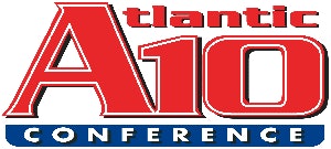
“The Atlantic 10 Conference has a proud and rich history, thus it was time to redesign our logo highlighting the strength, speed and commitment of this league,” stated commissioner Bernadette McGlade. “Our branding has been updated and modernized to keep pace with our membership. I love the versatility of the new marks, including the ability of our membership to utilize the conference logos in their own approved color palette.”
The new identity is yet another move for a conference that has seen its fair share of movement in the last two years: Davidson officially joined the Atlantic 10 on July 1; in 2013, the conference welcomed George Mason University but lost Butler and Xavier to the new Big East and Charlotte to Conference USA. The 14-member A-10 now consists mostly of private schools near the East Coast, but does include schools as far west as St. Louis University in Missouri.
The Atlantic 10 is coming off a strong year athletically as six teams from the conference qualified for the NCAA Division I Men's Basketball Championship. However, only Dayton advanced as far as the Sweet 16. With a positive outlook for the 2014-15 season, a new, eye-catching logo could be just what the conference needs.


