On an iPhone or iPad, all apps are created equal. Unless you create folders for them, they'll float around in front of you in a loose grid, in various colors but each the same size, stretching to infinity beyond the touch screen's right-hand border, each new page of them accessible with right-to-left swipes of a finger.
But you're standing or sitting still when you operate your preferred iDevice, and what's more, you can afford however much time it takes to find what you're looking for. Cardio equipment is different - if you've just stepped on it, you want to start moving, and if you're already moving, you don't want to fall down. Moreover, on some types of fitness equipment, your movements make controlling the controls difficult.
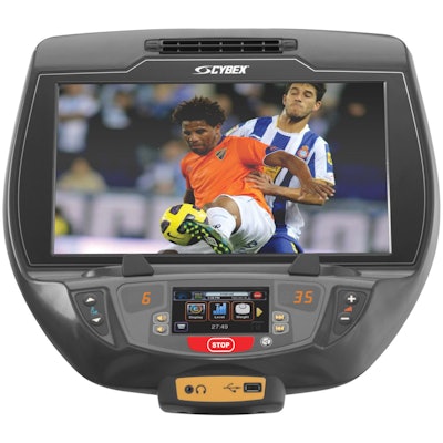
Those are some of the reasons that fitness consoles follow a logic similar to newer consoles in cars, according to Steve Suchanek, director of product management for fitness equipment manufacturer Cybex. The idea is to place limited information in front of the user, primarily the controls used most often. "Nobody's logic is terribly different," Suchanek says of fitness manufacturers. "The difference is in how it's implemented."
However, beyond large red "STOP" buttons and smaller green "GO" buttons (and a large and centrally located "channel up," which is the most-pressed button on fitness equipment), how it's implemented varies considerably, which makes the befuddled first-time exerciser somewhat of a staple of fitness centers.
 770Arcs_E3.jpg
The second thread, the parallel approach, puts every choice in front of the user. "If you have 30 programs, there are 30 program buttons," Suchanek says. "There were some examples of this in the early '90s, not quite the 30, but lots of buttons. It made the equipment look like the cockpit of the space shuttle. In fact, I have a picture of the cockpit of the space shuttle that I take out whenever we start talking about display ideology."
A hybrid approach - now that's logical - is most often used these days, but designers are feeling some serious pressure to accommodate a growing array of functions such as viewing screens and audio controls that require as many buttons as the various workout programs. And as they work using color, button size and placement, multiple display screens and so on to establish a logical hierarchy of controls, all the while they recognize that a certain amount of befuddlement will always be present. "People are really intimate with their smart phones," Suchanek says. "They're not nearly as intimate with the fitness product they use - and nobody can ever find the owner's manual."


